One of the most impactful projects I led at Cogito was the company’s full brand refresh. I was excited by the opportunity to evolve the visual identity to better reflect Cogito’s core focus on emotional intelligence, something that wasn’t coming through with the dated stock imagery and a limited blue color palette.
Within my first eight months, I successfully developed and launched a completely new brand system. This included a refreshed logo, expanded color palette, updated typography, photography, iconography (for both marketing and in-product use), and redesigned templates for presentations, email marketing, and office branding.
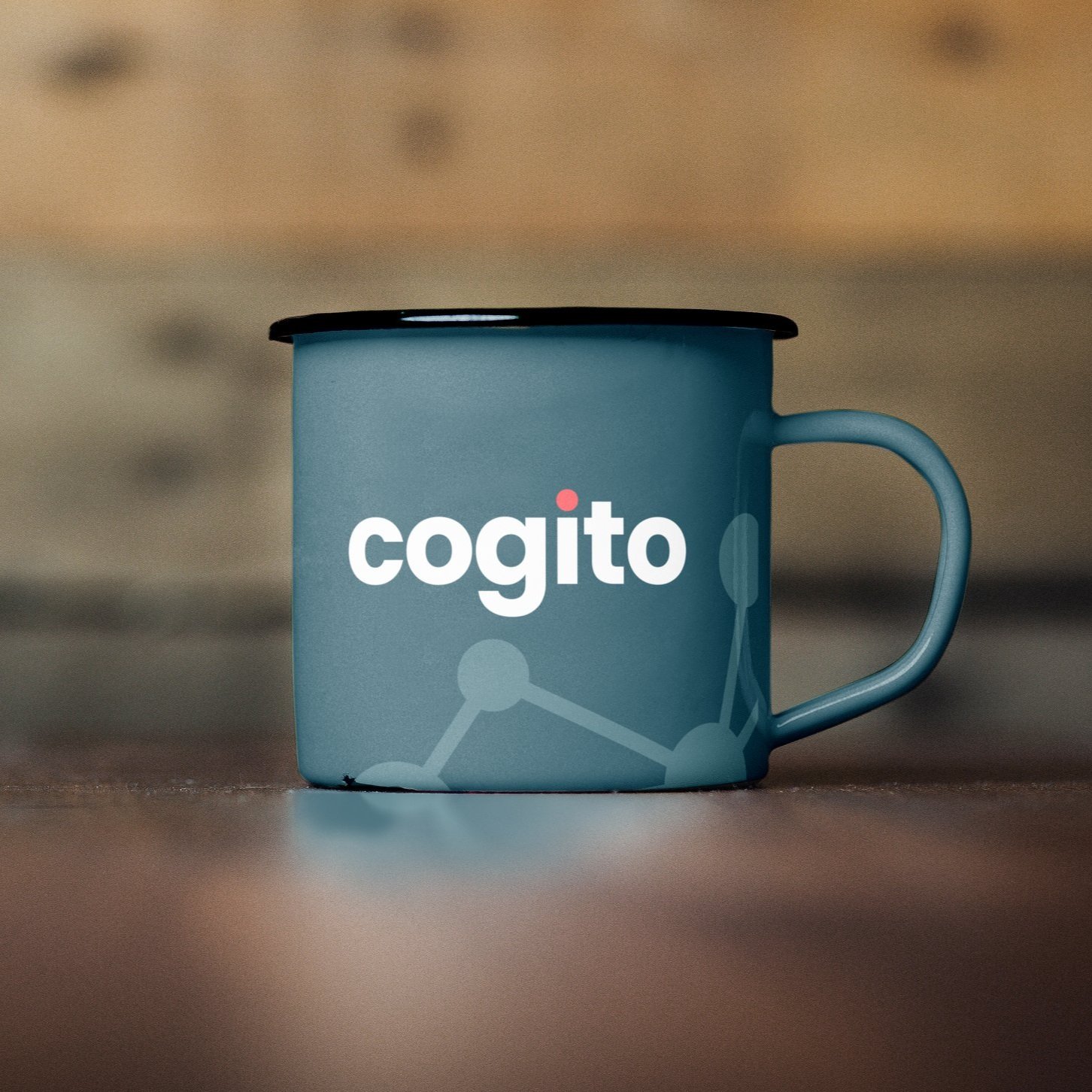
Cogito Brand Identity Refresh
A sleek, contemporary, and people-focused
brand identity.
When I first saw the original logo, I understood the intent behind the vocal wave icon, but it felt visually chaotic,
like the waves were clashing rather than communicating. I wanted to create a logo that felt clearer and more intentional, integrating a recognizable element directly into the wordmark while maintaining a clean, modern aesthetic.
The redesigned logo is more human-centric. The “i” in the wordmark symbolizes the individual at the heart of Cogito’s mission and our clients’ work, while the dot, highlighted in our vibrant candy pink, draws the eye and anchors the brand’s visual focus.
Human connected, a secondary element
The dot on the "i" symbolizes humans, while the network graphic gains a deeper meaning
as a secondary element, representing the human connections fostered by Cogito.

Elevating the human experience
through color
The refreshed color palette brings the warmth that Cogito’s brand was missing. The new primary hue, a warm blue-green, combines trust, stability, and confidence with a sense of growth and renewal, serving as a steady anchor across all channels.
Complementary supporting colors enhance this core shade, reinforcing the brand’s human-centered focus and adding the emotional depth that was previously absent.
A diverse palette is a happy palette
The original color palette was limiting. By adding a secondary palette with light, medium,
and dark tones across a diverse color range, Cogito gained the flexibility to show variations, clearly present data, and harmonize both product and brand palettes.
Additionally, every color in the expanded palette was rigorously tested to ensure it met
WCAG compliance standards.


A new font that shows that Cogito
is friendly and approachable
The primary font is Poppins, with Roboto as the secondary font. Here's why they were chosen:
Both are Google Fonts, aiding future localization efforts.
They elevate Cogito as a strong yet approachable brand.
Modern sans-serif style.
Clean, smart, and professional appearance.

Primary Font: Poppins

Secondary Font: Roboto
Illustrations that convey the story
when words fall short
What’s wonderful about illustration is its ability to reimagine reality in a way that feels familiar yet refreshingly unique, making it especially effective for conveying complex ideas.
It allowed us to tell our brand story consistently across multiple platforms (web, print, social, etc.).

A simplified icon style
By using a flat, simplified icon style, we’ve created a clean and straightforward icon library.
This approach allows users to grasp our message easily without unnecessary complexity or embellishment.

Authenticity through diverse
and inclusive photography
Stock images in design hold significant power: seeing someone who resembles you in an image is empowering. It promotes inclusion and raises awareness. It's essential that our photography represents the people who use Cogito.

Corporate and tradeshow materials
Clean, simplified graphics allowed key elements—like the logo on a business card or messaging on a banner to stand out with clarity and intent. By minimizing visual clutter, the network graphic evolved into a versatile brand element, seamlessly linking everything from corporate identity to trade show materials.


Corporate swag
How we represented ourselves as a company outside of the office was just as important.

Bringing the brand to the office
You only get one first impression; make it count.


