Hydrow Brand Refresh
As the creative lead on Hydrow’s brand refresh, I was responsible for evolving the visual and verbal identity to support both evergreen storytelling and high-performance promotional campaigns. The goal wasn’t to reinvent, but to refine—preserving the brand’s core while modernizing how it shows up across key channels.
I established a refreshed hierarchy across foundational elements, promotional layers, and evergreen creative. This included a new promotional color palette, expanded use of branded graphic elements, and refined typography to create stronger visual cohesion across campaigns and site experiences. I also led the development of new email templates and landing pages that flex between brand and conversion needs, all grounded in scalable design logic. From punchy, promo-driven headlines to nuanced design choices in homepage and PDP treatments, the result is a system that allows Hydrow to show up with more clarity, energy, and consistency—whether it's Black Friday or just another Tuesday.


Objective
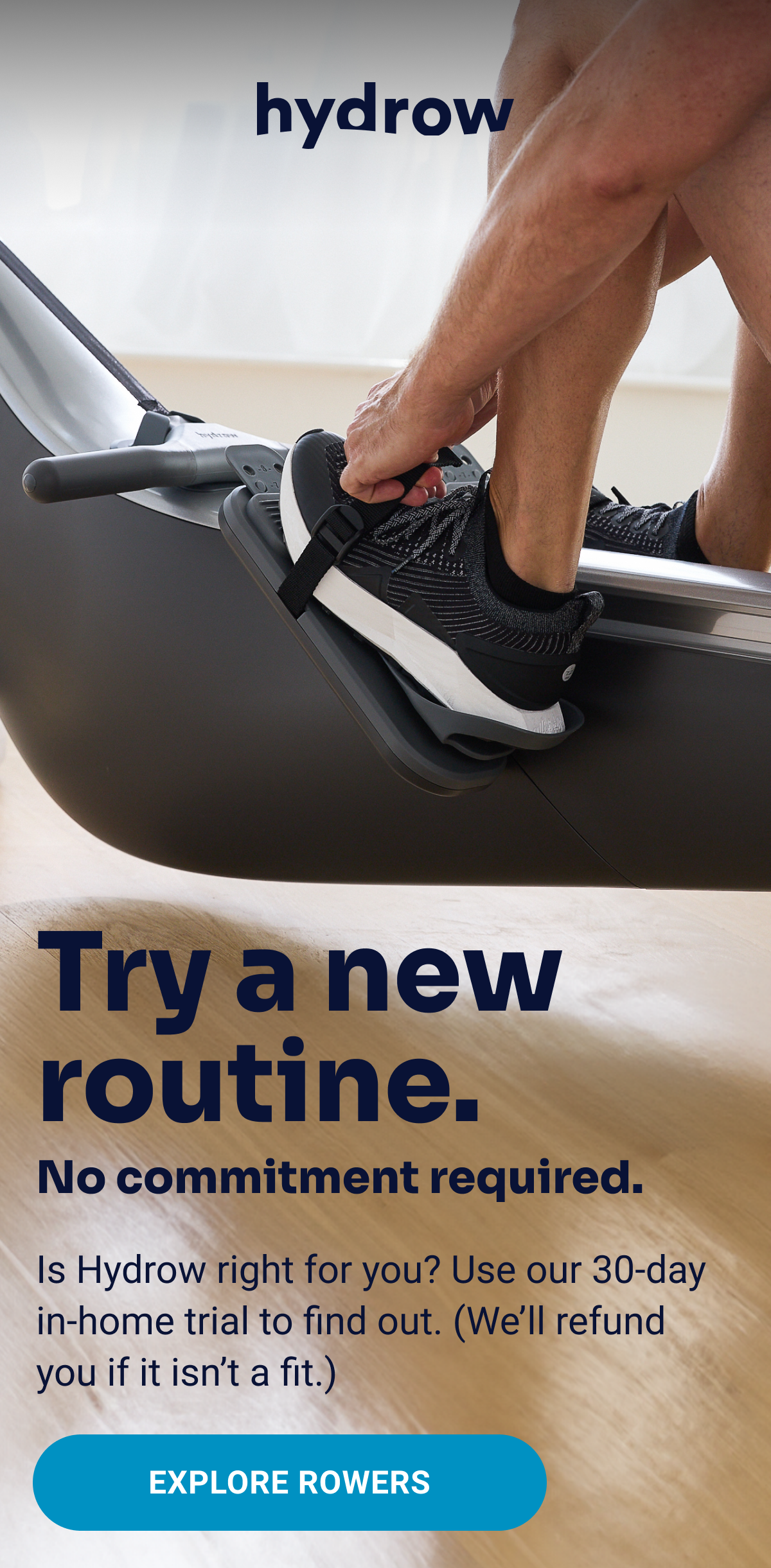
Following the pandemic, Hydrow’s brand had lost clarity and cohesion. We needed a comprehensive refresh to create a more modern, elevated, and user-friendly visual identity. This included updating typography, iconography, and photography to build a design system that balanced expressive branding with performance needs across all channels.
Approach
Strengthening the Foundation
While the core type system and brand palette remained largely intact, we introduced subtle refinements to improve versatility and clarity. This included adding updated grayscale tones for depth and refining the usage of highlight colors to better distinguish between base brand and promo layers. The typography was anchored by Sora for headlines and Roboto for body copy, balancing clean modernism with accessibility.
Clarifying the Visual Language
I established a visual design system built around modular elements, bathy line accents, image/color containers, drop shadows, and layered banners that could adapt across channels and content types. These ownable components added consistency across brand, promotional, and seasonal creative while allowing for visual variation.
Evolving Promotional Strategy
I developed promotional palettes and a scalable component library designed to support rapid campaign deployment. High-impact color treatments and bold type pairings were used strategically to highlight urgency (e.g., “Only 48 hours,” “Save up to $400”) without overwhelming the viewer. A tiered email system was introduced, with design and copy adapting by priority and campaign scale.
Building Flexible Templates and Systems
To enable creative consistency and faster execution, I rolled out refreshed templates for emails, landing pages, PDPs, and homepage hero modules. Each template was designed to accommodate both full-funnel messaging and creative nuance. Importantly, design decisions were anchored in a system of interchangeable layers, promotional, component, and evergreen, making the brand more agile and cohesive.
Copy That Converts and Connects
I refined Hydrow’s tone to better flex between promotional urgency and inspirational energy. Campaign headlines like “Ready to feel the burn?” or “These savings are hot (like, hot-hot)” brought personality to the brand voice, while evergreen messaging focused on performance outcomes and member retention (“See why over 90% of Hydrow customers are still active one year later”).
Results
This refresh established a scalable brand framework that enables creative teams to deliver compelling, high-performing work, without reinventing the wheel each campaign. It strengthened brand recognition across touchpoints while giving the marketing team the tools to move faster and more effectively. Today, Hydrow’s creative system is more aligned, more adaptive, and better equipped to drive both engagement and conversion.